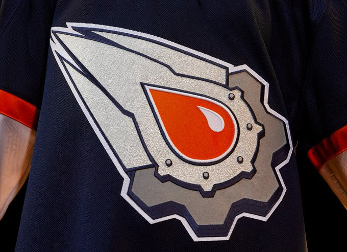
Today, the Oilers finally unveiled their Reverse Retro jersey. Most hockey fans in the city have seen it leaked, already.
It’s a take on the team’s third jersey that was unveiled in 2001, during the NHL’s first phase of third-jersey unveilings. Before this period of time, teams had a white home jersey and a dark road jersey. The third jersey was a novelty. It’s commonplace now, and, in fact most pro sports teams have more than three jerseys. It feels like the NBA jerseys change nightly, right?
Basically, the new Reverse Retro jerseys add some orange to the blue-and-silver third jersey that was designed by famed Canadian comic artist Todd McFarlane (Amazing Spider-Man, Spawn), who was a member of the Oilers’ ownership group back in the early 2000s.
The editor of Edify (well, me) was the editor of Zone, the official team magazine of the Oilers, back then. And, when the jersey was being designed, I had the chance to chat with McFarlane about the process. Since this look is being brought back, let’s go back in time to understand what McFarlane was thinking when he designed the five-rivet logo.
McFarlane said he is not a fan of teams that put the cities’ names, team names, hockey sticks or pucks in the logo. He said that it’s too obvious, and that cues should be taken from many of the Original Six designs (though the Leafs and Rangers, well, both put their names on their jerseys!).
“We designed a couple of prototypes and, not only did it need to look good from two feet away, it had to look good from 100 feet away, and it had to look good on TV, too,” said McFarlane. “I had seen many other teams’ approaches, and there is a tendency to overcorrect the details. And, I think it gives some of them a look that’s too crazy.”
The five rivets on the logo symbolize the Oilers’ five Stanley Cup wins. Sadly, the logo’s symbolism works just the same in 2022 as it did in 2001 — no more rivets needed.
