Sitting atop a bluff in the river valley and overlooking an expanse of woodland and water is Wolf Willow Ridge, a high-end residential division in the city’s west end. The prestigious subdivision is home to many beautiful luxury homes. Few, however, stand out in this cityscape of traditional, stone-faade dwellings with their multi-gable, hip and pyramid roofs. One home in particular that demands a second look is that of Monica and Rakesh Patel. With strong, linear lines, a simple, yet sophisticated structural aesthetic and a balance of modern and organic elements, the “Alpha Wolf,” as it was dubbed by the designers at Habitat Studio, lives up to its name in both eminence and edge.
A fantastic view was the catalyst for Monica, 36, and Rakesh, 39, to move to Wolf Willow Ridge. The couple had previously built a home in the Terwillegar area, where they lived for nine years. But, an inherent interest in real estate and architecture – and perhaps a slight addiction to surfing the MLS listings- resulted in an opportunity to purchase the lot in Wolf Willow. Monica and Rakesh pounced on it, but it would be two years before they initiated the design and build process. During that time, they created a file of ideas and inspiration for their would-be dream home.
Planning for a third baby – the couple havetwo sons, six-year-old Jy and three-year-old Kade, and now, a baby daughter, Sage – was the final impetus to begin constructing their new home.
“The other house that we built was pre-kids and didn’t have the extra bedroom that we knew we would need,” says Monica. “We developed a much better idea of what would work for our family.”
The Patels chose to capitalize on their river valley view by reversing the layout for their 5,800 square-foot home. The bedrooms are situated on the main floor, and the kitchen, dining and living areas are located on thesecond floor, an architectural arrangement they had observed in homes on British Columbia’s west coast. Though they initially questioned whether a reverse layout would be too peculiar for resale, they knew they were building their “forever home,” not just an investment property. Deciding to forgo the conventional layout meant just a few minor adjustments, including the installation of a dumbwaiter in the mudroom so they didn’t have to “schlep bags of groceries up the stairs.”

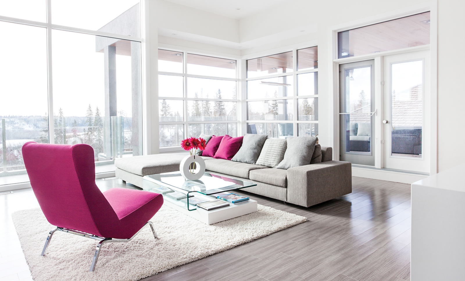
“We spend all of our time up here,” says Monica, sitting on a heather grey sofa in front of a wall of floor-to-ceiling windows that overlook the river valley.
Norm Perrin, director and project manager for Habitat Studio, had no qualms about fulfilling their request for an unusual layout. In fact, Perrin encourages the option of having the living areas on the second floor whenever possible to clients. “The views are from the second floor, so take advantage of that,” says Perrin. “Nowhere in any building code or bylaw does it say that you have to have the kitchen on the main floor.”
There are no bylaws – thank goodness – for interior-design choices either. In fact, some of the best interior artistry emerges froma fusion of various styles. Monica and Rakesh compromised when it came to their individual tastes by creating a home that is both modern and rustic, a happy medium that Monica jokes is “a bit of an oxymoron.”
Rakesh adds, “I wanted really modern, and Monica didn’t want it to be so modern that it would feel cold.”
The balancing of modern and organic is apparent as soon as you walk through the dark amber-coloured, cedar front door. A multi-textured wall of high-gloss and cedar panels that feature the rich, saturated hues of Peter Lik Arizona canyon photographs becomes a piece of art in itself. A staircase with stainless steel and glass railings allows natural light to permeate the space.
Monica and Rakesh love to entertain, so they opted for an open plan on the second floor, with hard maple flooring in soft grey, which seamlessly transitions between the kitchen, dining room and living room. The couple also chose a neutral background palette of grey and white, a departure from their previous home, which had a lot of chocolate brown.
“Every time we looked at paint colours, I would ask, ‘Is there any brown in that?'” Monica says. “Do you see beige? Because I don’t want any brown or beige.”
They did incorporate some brown, however, favouring glossy, sapele wood cabinets in the kitchen to warm up the space. Additional cabinets and countertops in high-gloss white keep the look clean and simple, and adjustable swivel bar stools in satin steel and ivory leather provide the perfect spot for Jy, Kade and Sage to hang out with colouring books while mom and dad are in the kitchen. A minimalist, milky glass Horizon range hood fan from Zephyr that Monica found onlineis contemporary and cool.
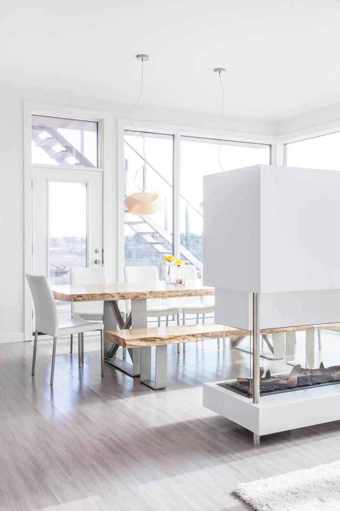
The reclaimed-wood dining room table, a custom piece built by local designer Darren Cunningham, injects a pure rustic element that keeps the space from looking too streamlined. Pops of fuschia and lime green in the living room, colours that are carried throughout the home, infuse the room with casual energy.
With a growing brood of energetic young children, the Patels prove that you don’t have to sacrifice high style for kid-friendly living. Adjacent to the main living space is a playroom where Jy, Kade and Sage can draw, colour and indulge their imaginations with a monster collection of toy snakes, dinosaurs and safari animals. When playtime is over, Monica and Rakesh can simply slide the custom-stained, cedar barn doors shut.
Though the second floor boasts a great view, the view from the first floor master bedroom and bath is nothing to balk at. Large windows allow ample light in during the day and provide canvas-worthy views of texture and colour, which change from season to season. Monica and Rakesh carried the palette of grey and white into the lower level, creating a modern, yet tranquil, environment. Each has their own walk-in closet, and Monica injected some glitz into hers with a custom fuschia cabinet countertop and a Swarovski crystal pendant light.
The Patel family home features multiple outdoor decks, including a rooftop patio with built-in heaters, providing a place for the family to cozy up under some blankets and read books together or just take in the view below. They recently found that a path passing behind their backyard leads to the Fort Edmonton Footbridge, which crosses the North Saskatchewan River.
“Every morning, when I walk up the stairs and look outside – it’s awesome,” says Monica. “When we moved in, a neighbour told us we would never take the view for granted. And we don’t. It’s pretty majestic.”
Personalizing a Space
Often, a request for a custom-built home is followed by requests for unique design elements. Norm Perrin, director and project manager for Habitat Studio, says these challenges are what makes building a home for a client even more satisfying. Here are a few of the custom ideas from the Patels’ home and how Habitat Studio made them happen.
Art Wall
The wall that showcases the couple’s Peter Lik photographic art was inspired by the set of Cityline, a daytime show that covers subjects like dcor, fashion and entertainment. Monica asked Perrin to watch an episode of the show so he could get an idea of what she wanted. Habitat Studio came up with a design and used medium-density fibreboard (or MDF) with a high-gloss furniture finish for the white panels. The wood panels were made with stained clear cedar and finished with lacquer. The result is a fresh, warm complement to the striking hot pink and flame orange canyon art photos.
Smokin’ Hot TV
The living room and dining room are partially separated by an Element 4 Lucius 140 three-sided fireplace, which was customized to house a hidden television that pops up at the touch of a button when the Patels want to watch it. “I’m kind of a TV Nazi,” admits Monica. “It’s just mindless noise, but I could see a purpose for having it in the main living area. We can hide it away, and if we have friends over for movie night, we can just bring it up.” Perrin says incorporating a television into the fireplace unit required a lot of planning and research. Habitat Studio designed the unit to incorporate many layers of concrete board to eliminate any chance of melting the television. The design also required a stainless steel post to support the weight of the television and the concrete boards.
Barnyard Doors
Perrin says the process to achieve the soft-grey colour of the barn-style doors was completely experimental. His team started with a container of vinegar, added a few steel wool pieces in the container and allowed the solution to sit for 24 hours. They then wiped the solution on to the cedar and removed it after a specific amount of time. A grey stain was then applied and wiped off. Once they had the perfect colour, a lacquer was applied. With satin-steel, sliding door hardware, the result is both rustic and contemporary.
Like this content? Get more delivered right to your inbox with Ed. Home & Style
Discover the cool things we’re obsessing over.


