Vignettes Design Series is, first and foremost, a chance for artists, designers and builders to share and play. It’s where different disciplines come together to create something that would never exist anywhere else. For most teams, that means making something that could never exist anywhere else, because a client would never say, “Do literally whatever you want.”
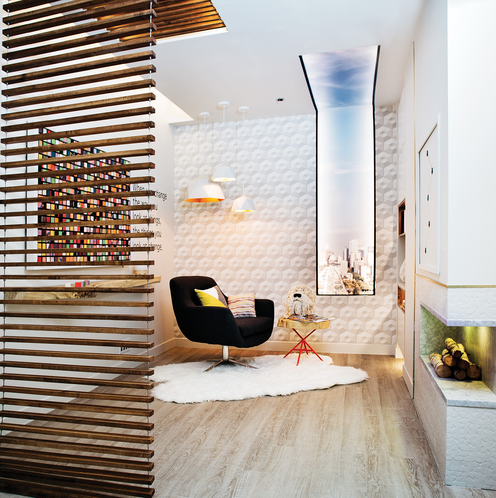
But one team, led by designer Michelle Pollock, bucked the extra and elaborate trend by using negative space to create the ultimate minimalist, less-is-more Vignette, a room that doesn’t overwhelm — at least not on first glance — but invites you to sit and study its measured and subtle details. But subtle doesn’t mean less artistic or complex.
The space starts with hanging wood slats, which act as a window blind where the fourth wall would be, as if you floated up several stories to peek into Edmonton’s most soothing and stylish therapist’s office. Once inside, details emerge, like the false window-skylight showing the downtown skyline, the framed out shelves and what appears to be the world’s easiest connect-the-dots artwork, until you look closer. No, closer. The dots are peepholes, four of which contain different colour fades plus one bonus — an image of the artist, Michel Cote, as his rock-star alter ego, Phat Seckzy Beetz.
The work is called “Cassiopeia Constellation,” and serves as a clue for Cote’s most colourful and complex contribution on the opposite wall, a block puzzle in pieces that’s part painting, part puzzle. A collection of 580 cubes combine to create one of the four matching colour fades, street art saying “Eckzplore,” or an image of Sabrina Pasterski, a brilliant contemporary physicist. If each cube faces the same way — if one of the six puzzles is solved — you see the corresponding colours or images. If the cubes are unmatched, you see beautiful, near-limitless disarray. You’re welcome to pick out each cube and line them all up, but it could take you a while to get it right.
