Selected by Sheri Krug, interior designer and board member of M.A.D.E. in Edmonton (Media, Art, Design Exposed)
Architect: CHANDLER KENNEDY
ARCHITECTURAL GROUP
Construction: CARLSON
CONSTRUCTION LTD.
Date opened: 1984
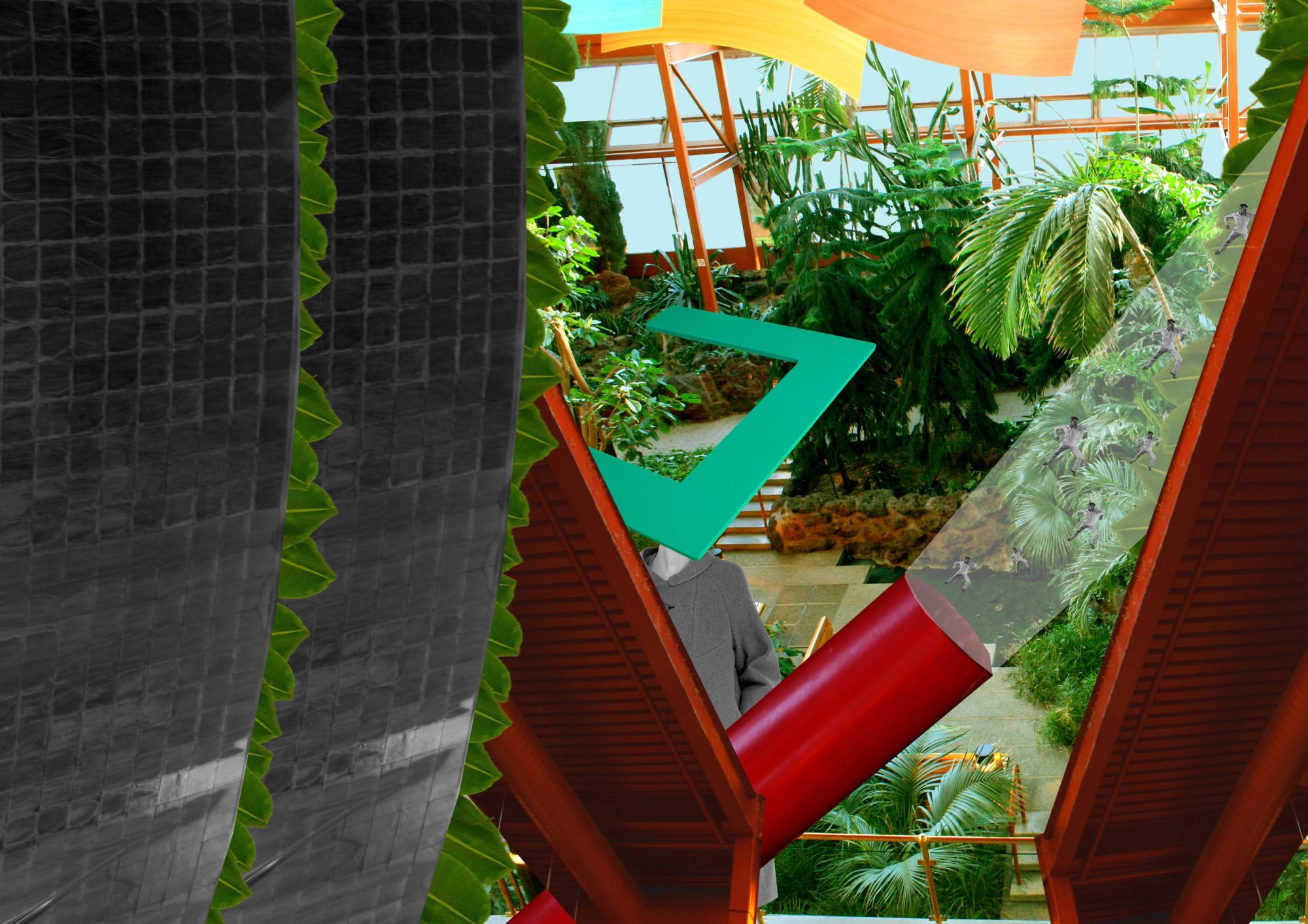
It’s a respite for the harried urbanite. Made of glass and steel, but softened with tropical plants and bubbling waters, the Lee Pavilion represents a treasured sanctuary for downtowners.
Interior designer Sheri Krug admires the Lee Pavilion because it sharpens her senses, and she suspects it works the same magic on other Edmontonians. “There’s something about the sense of place at the Lee – the humidity, the water trickling, how you can smell the plants,” says Krug, whose own firm focuses on residential interior design. For her, those calming natural elements are the perfect escape from “the busyness of downtown.”
The Chandler Kennedy Architectural Group, which no longer exists, designed the multi-level pavilion with massive glass panes for airiness and natural light, crisscrossed orange beams that lend an urban-industrial warehouse flavour and about 18 metres of headroom at the highest point.
Downstairs, sloping walkways meander through a lush green garden. That makes the lower level of the Lee a good spot for a quiet moment, while the upper walkways provide a scenic indoor shortcut for people rushing to work or the LRT.
“I love the way they’ve allowed the plants to take over the space,” says Krug, pointing to the creeping fig dangling from the beams and draping over corner walls. “It incorporates man-made and natural elements, but it feels organic.
It allows the users to situate themselves in a place they can see and be seen, or allows for some self-reflective time.”
“I just love the sheer expanse of the space and then how in the evening it’s a lot more closed-in and intimate,” says Krug.
When the box office window slides up and the doors of the Maclab Theatre open, the Lee becomes an exotic night garden for theatre-goers discussing the mise en scne over sips of merlot.
Krug is charmed by the way it transforms itself, slipping into a new role as actors do.
Chosen by architect Vivian Manasc, principal architect of Manasc Isaac Architects Ltd.
Architect: DUB ARCHITECTS LTD.
Construction: STUART OLSON DOMINION CONSTRUCTION
Date opened: 1992
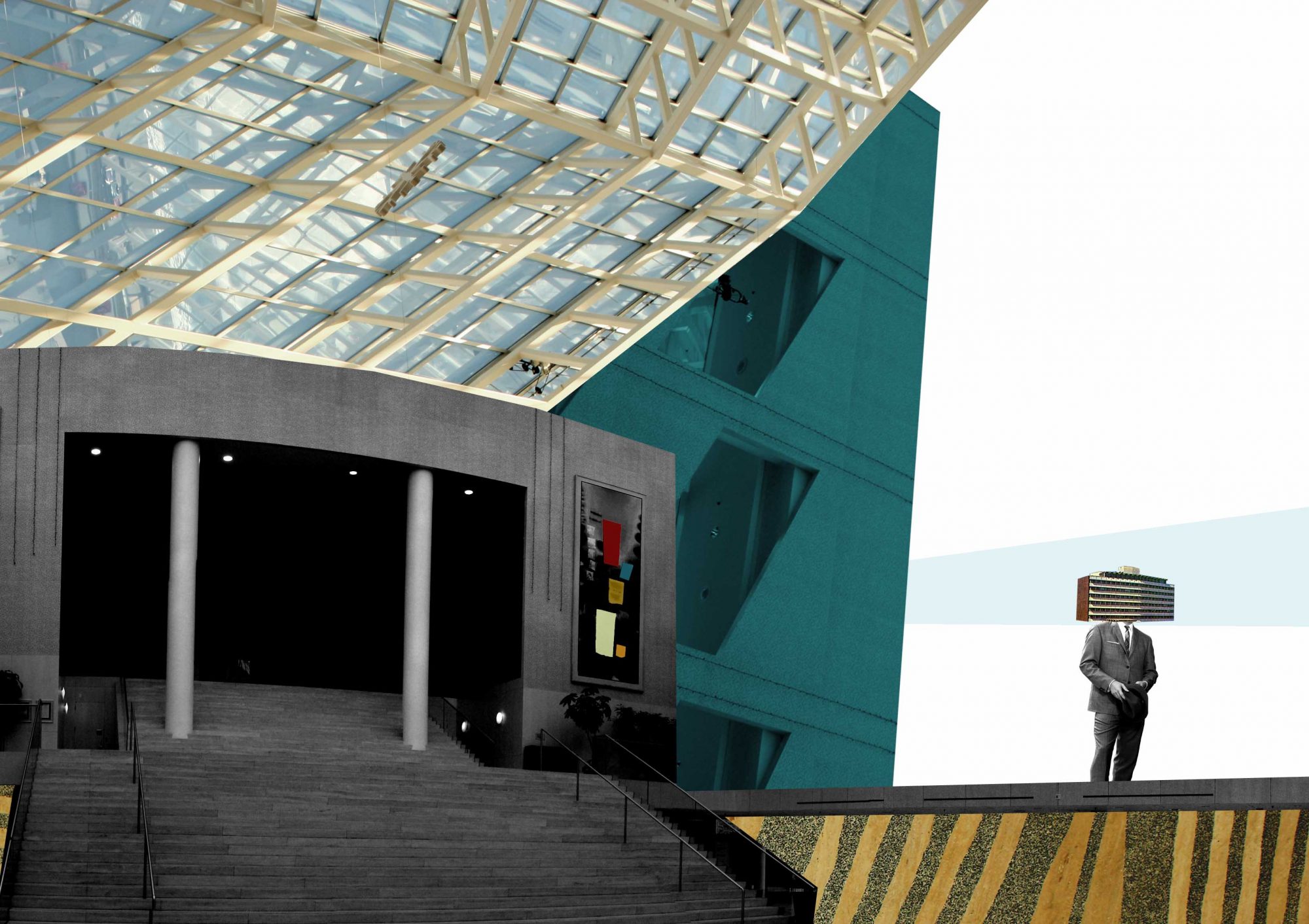
The City Room is the undisputed wow! space of Edmonton City Hall. The room is voluminous, dramatic, bold in broad strokes and subtle in detail. It’s the focal point of the civic complex, which has earned local architect and former alderman Gene Dub six awards since it opened in 1992.
Architect Vivian Manasc is one of its many admirers. “It has a nice energy to it – a sense that Edmonton is an energetic city where exciting things happen.”
The pyramidal glass roof, reaching 43 metres above the three-storey building, and the angled exterior windows on all sides have a major impact on visitors and employees. The glass allows the contemporary space to shift moods from morning to night, when natural light gives way to interior lighting, emphasizing the room’s unusual contours. “There’s a lot of movement with the different angles and shapes,” says Manasc, “and because the light is always changing, it makes the space feel very dynamic, regardless of the time of day.”
She applauds the inventive use of materials. Her own firm is recognized for its sustainable designs, so naturally one of her favourite elements here is the beige travertine stone cladding preserved from the old City Hall. It was repurposed and combined with a modern grey terrazzo to make a new floor. “The floor is lovely and it’s also reminiscent of the old building, so there’s a really nice storytelling quality,” she says.
The choice of maple, “a warm, rich, light wood,” works well for the walls, where some sections feature fine, laser-made cuts, Manasc says. “They look like marble from a distance, but actually house acoustic material that absorbs sound and makes the space
not ‘echoey.'”
Another strong design element is the imposing stairway leading to council chambers. It’s cleverly multi-purpose, acting as a seating gallery or a stage, depending on the event. “You can have the audience [on the floor] looking up or sitting on the steps looking down,” she says. “You can really play with the space.”
Chosen by Giuseppe Albi, general manager of Events Edmonton
Architect: RANDALL STOUT ARCHITECTS INC.
Construction: LEDCOR CONSTRUCTION LTD.
Date opened: 2010
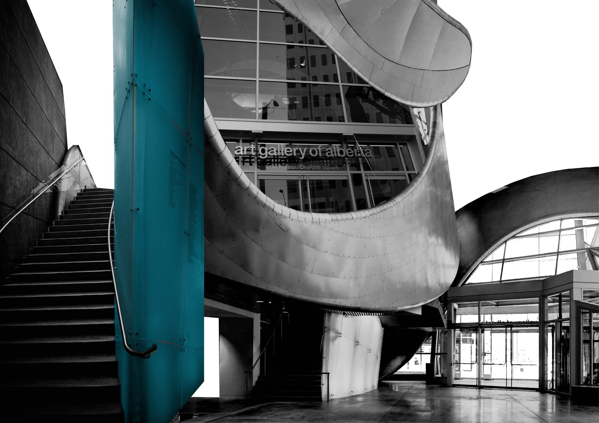
The Art Gallery of Alberta is the latest addition to Sir Winston Churchill Square, in the heart of Edmonton’s civic and cultural district. Fashioned out of patinated zinc, glass and 800 tonnes of structural steel, the AGA swoops and dips and rolls around the corner of Rue Hull and 102A Avenue like a magnificent metallic swallow.
Design expert Giuseppe Albi says the central atrium is his favourite aspect of the new AGA. “It’s engaging and dynamic,” he says.
He calls it “the connector,” stitching together all the gallery rooms and offering an exhibition on the inside and outside. When used together with the adjacent Sir Ernest Manning Hall, it’s also a banquet room that can fit up to 300 people.
“It’s the main access to all the floors [and] everywhere along the way you can stop and look out through the atrium and see the square, our civic plaza and city hall,” says Albi, a longtime observer of architecture in the city and a former member of Edmonton’s Urban Design Review Panel.
The atrium is also intimately connected with what has been nicknamed “the Aurora Borealis,” a 190-metre steel ribbon curving in and out of the building. Los Angeles-based architect Randall Stout, who beat out 24 competitors to win an international competition to design the building, took inspiration from the northern lights and the way the North Saskatchewan River zigs and zags through Edmonton in creating this pivotal visual effect.
“It creates a very dynamic atrium on the corner; not a typical entrance at all,” Albi says. “Because of its relationship to Churchill Square, that intersection is vital. It’s accessing and animating the public space.”
Chosen by Tom Sutherland, architect with Dialog
Architect: PETER HEMINGWAY
Construction: ARROW MANAGEMENT
Date opened: 1976
RENOVATIONS: LORAC CONSTRUCTION LTD.
For enduring views in the city, there’s no beating the Muttart Conservatory, architect Tom Sutherland believes. “The Muttart is a classic piece of architecture,” he says. “It is a very simple building and a very clear, very strong plan.”
The pyramids on the western edge of Cloverdale are recognizable in almost every aerial or wide-lens photograph of the river valley taken since the Muttart opened 35 years ago. Sutherland is enthusiastic about the components of the conservatory that give it iconic status.
Designed by the late Edmonton architect Peter Hemingway, the Muttart consists of four linked glass pyramids that house intercontinental flora. Sutherland says the pyramid is a strong, timeless shape. Hemingway’s repeated use of the shape quickly proved popular with the public and the architectural community in the city. “Even within a very short period of time, it became a symbol of the city and showed up on City Hall and the IPL Tower [now the Enbridge Tower] . Any building that’s mimicked that much is well-liked.”
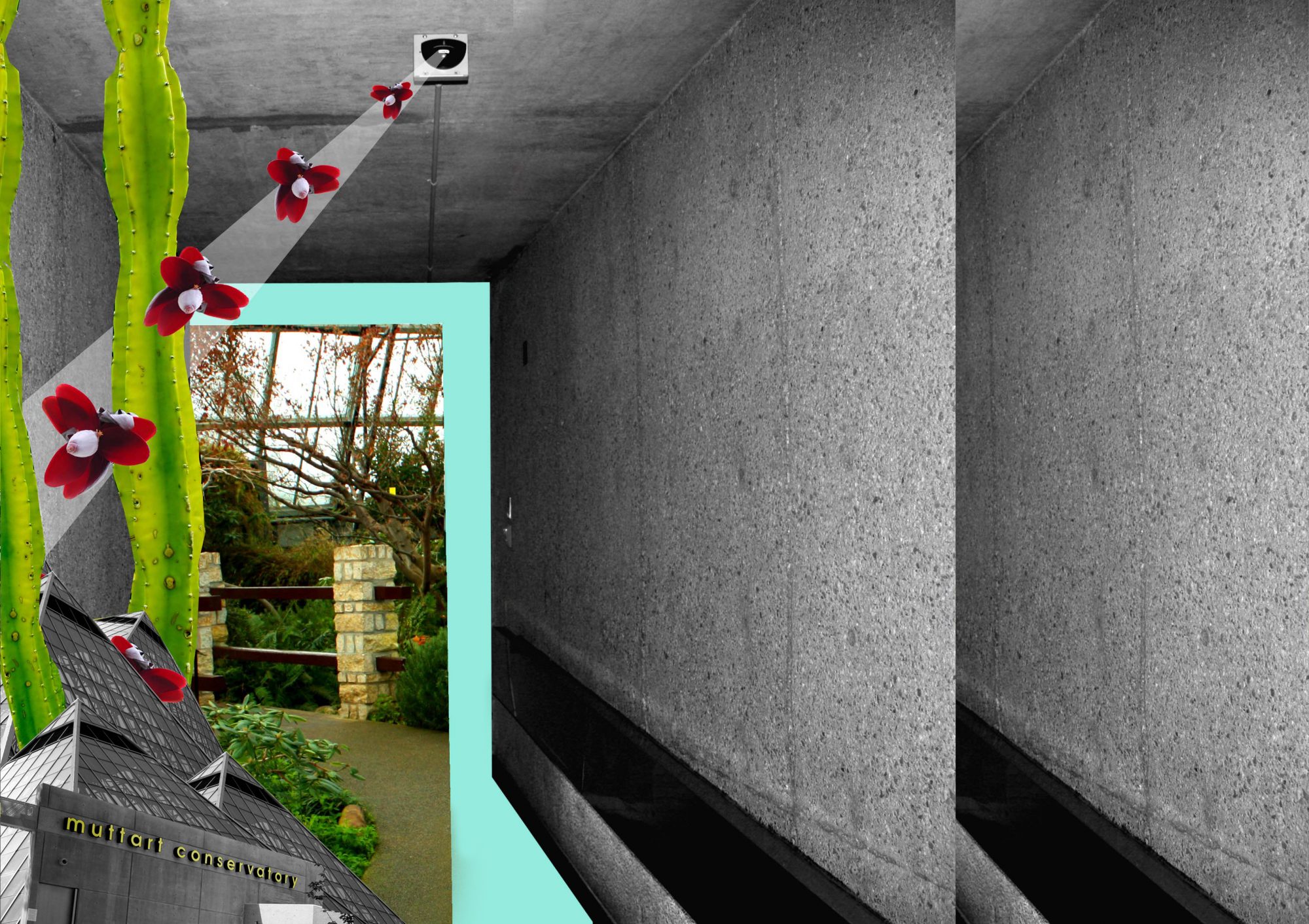
Each pyramid tells a different story. There’s the close, steamy tropical zone, where broad-leafed palms drip with moisture; the parched and pebbled arid zone, filled with cacti and succulents; the temperate zone, cool and fresh with scents of evergreen and eucalyptus; and the feature pyramid for changing floral displays.
The building has tunnel-like entrances that lead to the various horticultural zones. It attempts to compress you down, to leave behind the world you’re in, and bring you into one of these new environments, Sutherland says.
“It’s kind of an Alice in Wonderland journey Hemingway is asking you to go on.”
A 2008 refurbishment by Rockcliff Pierzchajlo Architects & Planners Ltd. has added a new outdoor entrance with patio tables and seating, altered the tropical pyramid so it’s wheelchair friendly and
created a larger restaurant and more classroom space. The Muttart’s ability to provide a taste of nature all year round is something visitors never fail to appreciate; it’s a perennial top attraction.
“People aren’t going to come back and flatten the pyramids or change them out,” Sutherland predicts. “People are going to want to conserve the Muttart, and it will continue to be embraced by the people of Edmonton for many, many years.”
Chosen by Adriean Koleric, designer and artist
Architects: SCHMIDT FELDBERG
CROLL and HENDERSON
Date opened: 1978
Construction: CANA CONSTRUCTION
Competitive swimmers and amateur paddlers, parents, grandparents and toddlers, the fit and the hoping-to-be-fit will likely declare the Kinsmen’s abundant aquatic space their favourite place for a splash. This giant complex, designed by the now-defunct architectural firm Schmidt Feldberg Croll and Henderson for the 1978 Commonwealth Games, has five pools to choose from.
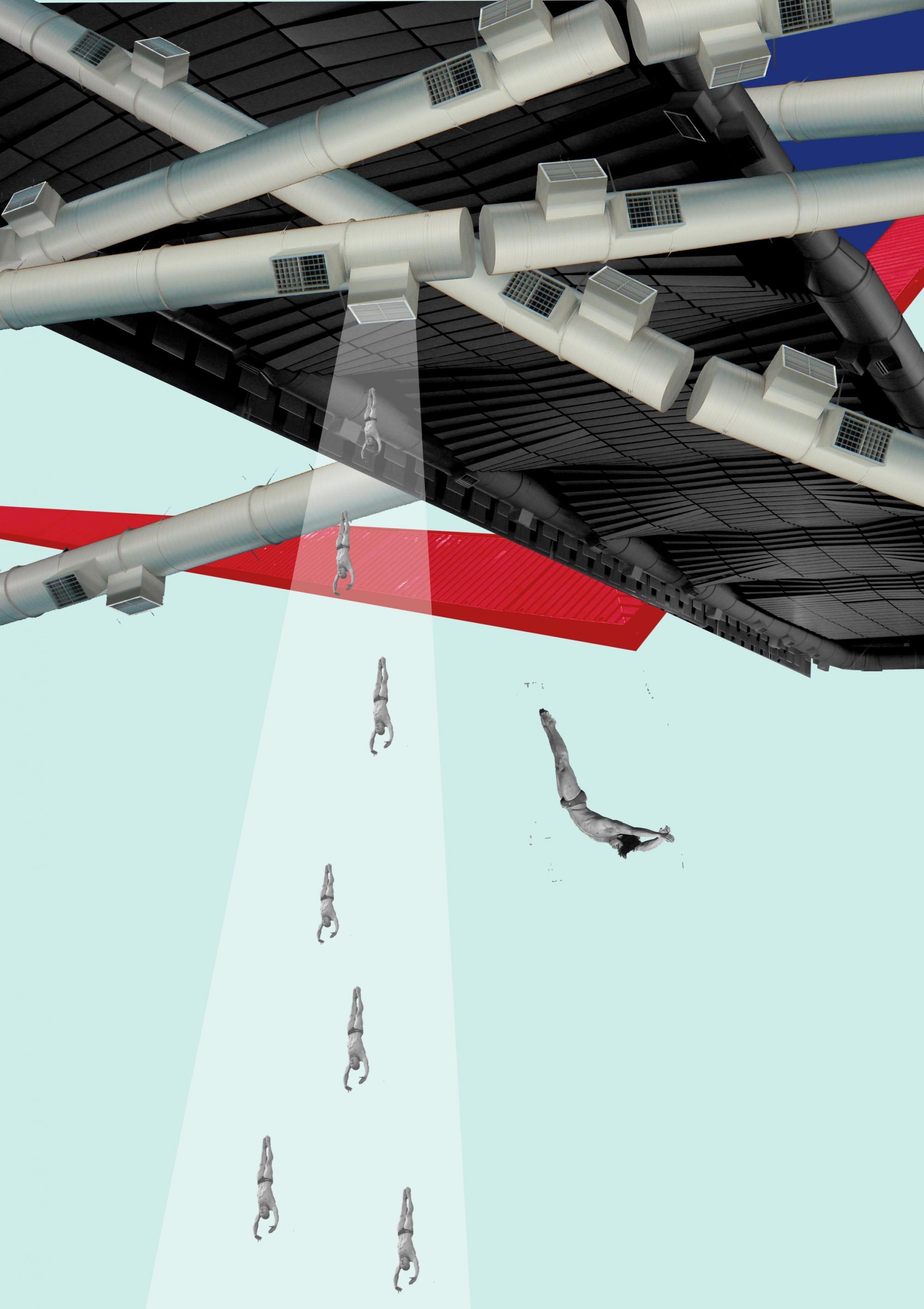
But something more abstract is at work, too. For designer Adriean Koleric, the facility is a refuge from life’s mundane aspects. “A good space provides escapism from the day-to-day, a separation from nine-to-five, a place to clear your head and daydream,” says Koleric, a NAIT graduate in interior design technology and an artist specializing in digital collage.
He’s inspired by the roof, an acoustic retrofit by Barry Johns Architecture, which evokes a swimmer in motion, with rolling waves. “It’s like this alien structure, how it mimics and reflects in the pool underneath. It’s amazing,” says Koleric, who has used photos of the ceiling in his own digital collages. (His work inspired Avenue to have him design abstract collages for all five spaces in this article.) “When you look at the way it’s laid out, it’s a great piece. And the acoustic panels hanging along the edges – it’s almost like jewellery for the ceiling.”
Esthetic twists such as the ductwork and a diving tower built on a slope have decorative purpose, with effective design and colour selection, offering an environment greater than what’s expected of a rec centre.
“The background colours are predominantly greys and whites, which put focus on the forms of these basic elements, like the diving boards, and how they’re sitting on this beautiful angled red bracket that’s almost a sculpture in itself; it’s like throwing in a poppy,” he says.


